In the previous 3 articles I reviewed some of the most important Agile metrics that Dan Vacanti’s ActionableAgile software helps you to get with ease. Those were Cycle Time with the help of the Cycle Time Scatterplot, and a multitude of metrics, provided by the Cumulative Flow Diagram (CFD). In the latest article we looked at Work Item Age and its importance with the help of Aging Work in Progress Diagram.
Looking at the Cycle Time Scatterplot we discussed the significance of percentiles and how they can be used to predict the cycle time and avoid the trap of a single-number, point-in-time answer. This is cool, you’d say, but not merely enough, and I would agree. We need better techniques to predict possible timeframes for a completion of a set of work items. And, sometimes, we need to know how many right-sized work items can be completed within a given time frame.
Let’s face it, we live in a real world, where “When Will It Be Done question” is as omnipresent as ever. We cannot bury our heads into the sands of the #NoEstimates beach and hope the questions will go away. Let’s learn better ways to answer those questions.
It’s the Stability We Seek
Before we start – a fair warning. Estimation, rightfully so, gets bad rap for being quite a poor predictor of future results. In my mind, it’s not that the techniques are wrong, or people are poor estimators. Those are the factors to the lesser extent too, of course, but the primary one is this. We are trying to estimate work that flows through a non-stable and unpredictable system.
Through the lack of flow discipline, focus on getting things done, strict prioritization and limiting work in progress, we conscientiously destabilize our work systems making them so less predictable. There are techniques, methods, tools and frameworks that drive system stability and predictability. That discussion is out of this article’s scope.
Just keep in mind, that none of the techniques, regardless of their sophistication, will produce good results in a non-stable unpredictable system.
To answer questions, “When will it be done” and “How much can be done in a given time” ActionableAgile provides 2 fantastic charts – Monte Carlo: When and Monte Carlo: How Many.
The Agile Metrics Casino
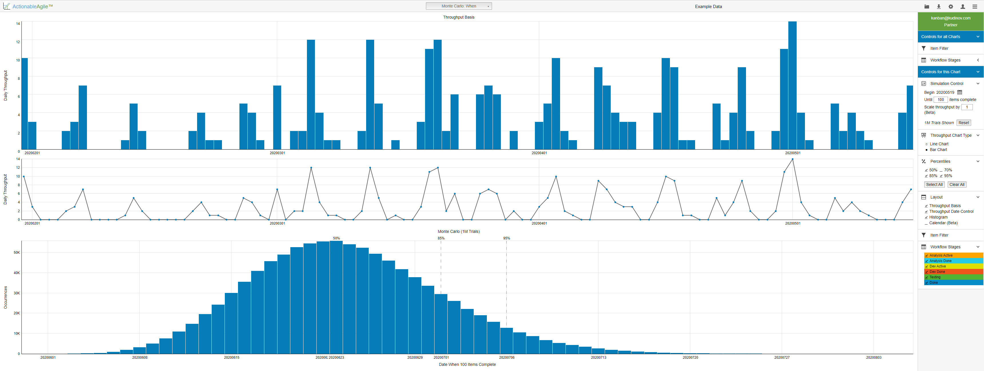
Next screenshot shows the When chart with all its additional features turned on. Those features are of a great help for an Agile practitioner. But let’s discuss briefly what the underlying process does and how we are going to use the information in the chart.
The idea Monte Carlo simulation based on is quite simple. That is the one Wall Street will not like. Past performance IS the predictor of future results. Monte Carlo simulation assumes, that replicating past performance, through thousands if not millions of simulations, gives us a better ability to forecast the future.
The Monte Carlo: When simulation considers sample or custom-loaded data and runs anywhere between 10 thousand and 1 million of simulations, randomly selecting a number of completed items on a single day from the pool of available numbers. Simply put, if in a given week you completed 5, 7, 4, 12 and 6 items a day, a fair Monte Carlo simulation would produce one of those numbers in each of its iterations.
The resulting chart highlights how many days it will take to complete the specified number of work items and what probability is assigned to that prediction.

In this case, based on the sample data, the question was how many days it would take to complete 100 work items. The chart gave the answer that if we started working on March 23rd, the 100 items would be complete by May 11th with the probability of 95%. If we can tolerate lesser certainty, we can say that same number of items could be completed 6 days earlier with a 10% less confidence. If you are pressed to complete these items within a month, the chart gave you an answer too – it was a coin toss.
The calendar below the chart gives you a fantastic representation of the answer you are seeking. The color gradient shows the probability of finishing work on each day within the specified timeframe.
This chart, as all others in the ActionableAgile suite of tools, is quite customizable. You can select the start date for your simulation, number of simulations to run, how many items you will need to complete. You can add or remove any of the non-essential parts of the diagram to focus on what matters most at the moment.
A note on the number of simulations. On the one hand it doesn’t particularly matter whether you run 10K or 1M simulations – the results will be quite similar. On the other, it doesn’t cost you anything to run a million of simulations. Just remember, the latter does not give you any better prediction, your percentiles on the diagram are still your primary guidance.
The More The Better?
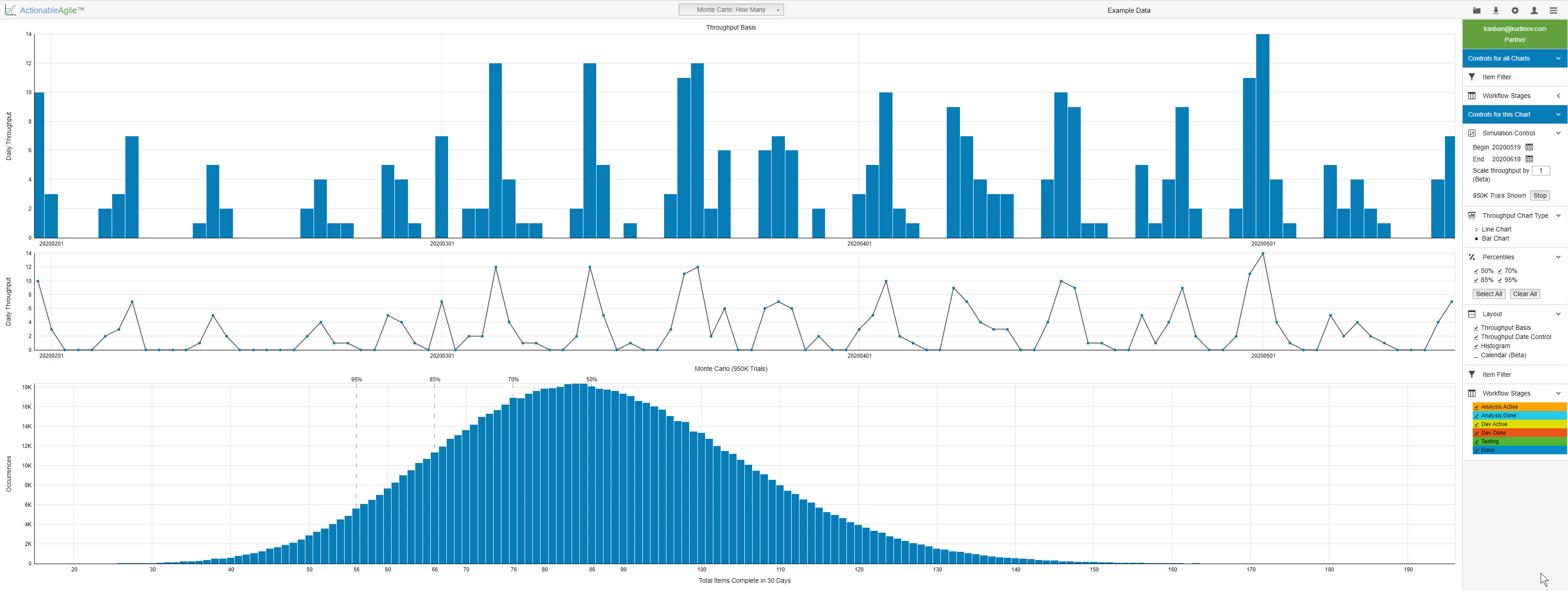
While the Monte Carlo: How Many chart answer a bit of a different question, it works in the same way as the Monte Carlo: When chart. Couple notable points though.
The probabilities on the chart start with the highest number on the left and decrease as we progress along the X axis to the right. That makes perfect sense. There is a higher probability that we will complete fewer items sooner. From the screenshot produced using the sample data, we see that within a month there is a 95% probability that we will be able to complete 56 items. 66 items could be complete with an 85% probability, and my favorite coin toss will produce the 86 days.

The calendar on the chart behaves a bit differently as well. The legend shows percentiles, and one of those is selected. Thus, the calendar shows the corresponding number of work items that cumulatively can be completed on the given day with the specified probability. You can select a different percentile and examine number of potentially completed items on any given day in the selected time interval.
Putting It All Together
This is a lot of charts and a lot of numbers you will say, and I will agree. And even then, I keep hearing “we track burndown and burnup” as an answer to a question, “What agile metrics, if any, would you track”. The answer to the “why” question are similarly amusing.
There’s an absolutely awesome page in the ActionableAgile software, that puts all these numbers together. That page gives you a comprehensive view of the current state of affairs. It’s the Dashboard.
It hits on all major categories of metrics such as Cycle Time, WIP, Stability, and Predictability. At the same time the dashboard gives you an instantaneous view and puts on a single page all the numbers you would be concerned with. If you only have a minute or two to get a sense of how the team is doing, take a look at this page. Feel free to drill down and explore other charts if some numbers jump out at you or pique your interest.
Wrapping It Up
In conclusion, I can’t say enough good things about Dan Vacanti’s ActionableAgile suite of tools. They make the work of collecting and analyzing all important metrics so much easier.
There are a few things that I would like to see in the software though, and those are more cosmetic and convenience features. Firstly, I would absolutely love the ability to store all kind of data in my profile, such as chart settings and loaded data – tuning a multitude of settings on each and every chart every time you need to print it out is a hassle.
Secondly, it would be great if I could connect more systems to pull data automatically, such as TFS and Azure DevOps boards. Right now, ActionableAgile supports csv/excel data, json data from a file or URL, Jira, Rally, and Trello boards. You can always revert to using example data to explore software features in detail.
If you are fascinated with the possibilities of tuning and adjusting your system, based on the actionable metrics and want to learn more, buy and read Dan’s books and subscribe to the free trial of ActionableAgile.
To read all articles reviewing Agile Metrics with ActionableAgile please follow this link.
